The expanding world of wearable technology is providing runners and researchers a treasure trove of scientific data. However, most of the data is largely ignored and the information gathered is not placed in context to help a runner avoid injury or make evidence-based decisions on how to train. To that end, for the past five years my lab at the University of Calgary has been focused on a concept we call Movement Mapping.
Movement Mapping can alert a runner that they may be on the verge of an injury, or exhibiting an atypical biomechanical pattern, and thereby be prompted to seek further attention. This paradigm consists of two critical questions: (1) how do we measure a runner’s typical running pattern? (2) how do we define atypical running patterns so we can alert them?
Most wearable devices measure some type of biomechanical variable, such as cadence, step length, or how much you move up and down. The more data we collect, the more accurately we can define the boundaries of your typical motion. Our research shows that each runner has a specific running pattern and if we collect lots of data from individual runs, and data from lots of runners we can construct a Movement Map.
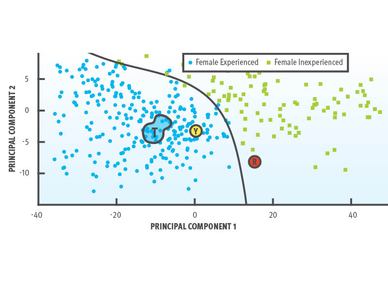
Here’s an example. We collected wearable data from 41 runners last summer, about half of whom were experienced runners and the other half inexperienced. In total, data for 724 runs were collected and tens of thousands of footfalls from each runner were used to create this Movement Map. Each individual dot is an individual’s pattern for one run and I’ve chosen an experienced female runner for the example below. Using some sophisticated math, we drew a boundary around the various runs for this runner (shown as “T”) to define her typical pattern. We also drew a boundary to separate and better define the experienced and inexperienced groups of runners.
Here’s where it gets interesting. The “Y” represents a Yellow Light situation where one Sunday this runner began to run outside her typical pattern, but she still ran similar to the other experienced runners within the map. The “R” represents a Red Light situation where the following Sunday she not only ran in an atypical manner, she also ran more similar to female inexperienced runners. During this particular run she experienced knee pain and had to stop short and take a few weeks off from training.
Could we have alerted her a week prior when the yellow light was flashing? Could we have helped her avoid this injury? We think the answer is yes, but we still have some research to conduct. Regardless, we think we’re on the right track in using wearable technology to help runners avoid injury and make good decisions about their training. Our overarching goal is to develop an app so every runner can benefit from this research and have deeper insight and access to their own data.